One of my favorite frequented websites that inspire a lot of design ideas is Bad Designs - which illustrates and discusses poor human factors within a wide range of products.
For those who may not be familiar with the term - Human Factors - it is essentially a kind of science which observes the physical and cognitive behavior of humans towards both environments and objects (tangible products and intangible service-related products such as software programs or websites). How do people of varying heights interact with a problem? What is their initial knee-jerk reaction? How easy is it to operate? Is the design so non-intuitive that it must require additional signs to prevent accidents?
Perception will usually bring attention to an apparent pattern in how people react. For instance, when someone approaches a door with a handle attached to its surface, they instinctively will try to pull it. However, if the door merely is flat with the absence of any handles, or only has a metal plate, then people instinctively understand that in order to get past this door, they must push through it - as there is no handle to actually pull. In a sense, the object itself deliberately limits options to minimize mistakes.
When designing products, services, environments, or overall experiences for people, it is essential to understand their naturally-occurring behavior ...how they intuitively react to these things when placed before them and apply this knowledge to design more intuitive solutions. Human factors is of course not an exact science because it varies slightly from person to person, of course, such as a small child to a teen to an adult to a senior (ie: A senior or a child may not be able to exert the same pressure as a teen or adult can or be able to comfortably open containers or access certain heights) and even variables such as how technically savvy they are with the latest products, or other cultural/regional differences can have an impact on how they react with the interface of certain objects.
Here were a few winners I've selected to show from Bad Designs. You can click on the titles to visit the example on that website.
- Guessing Games -
Which Switch Controls the Projection Screen?
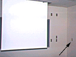 How many times have you walked into a classroom or some other conference space where the switches are literally scattered across the walls in the most non-intuitive fashion just beckoning you to guess which switch is the one you're looking for? In the image above, the switch to control the project screen is actually the one furthest away from the screen. How obvious is that?
It's amazing that similar design issues continue to occur this way with little to no improvements - not not even a text or graphic label to accompany the switch.
Raised Labels or Flat Buttons?
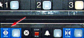
Another analogous design issue is the one commonly found used in elevators where they have raised/embossed labels right next to the actual button which is oftentimes just flat. People have the natural reflex towards tactile surfaces. In other words, they push the graphic label as opposed to the flat button next to it, especially when it is a quick reaction (ie: a scenario where you see someone trying to make it to the elevator just as its doors are closing and try to push the "Door Open" button, which for whatever reason doesn't work. So instead of figuring out which other button to push, you risk getting your limb clamped on by sticking it out to keep the elevator doors from closing?)
Light or Breeze?
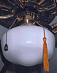 Many ceiling fans with lights integrated into them often have two switches. What's interesting is that they tend to be identical in every way - form, size, color, material, location, etc.
Even if one tries to differentiate the switches by adding on a tassel or whatever, unless it's highly obvious, even that can be easy to forget. In the image above, a yellow tassel is placed one one of the two switches. But the yellow tassel could represent light or it could not. It still leaves it entirely up to the user to interpret the train of thought. A very obvious fool-proof (at least a better attempt at it) solution can be changing the location of the switches - The light switch can be hooked below the light as the fan switch hangs from above the light.
- Using & Maintaining Liquid-Oriented Products -
Coffee On Your Nose & Odor Inside
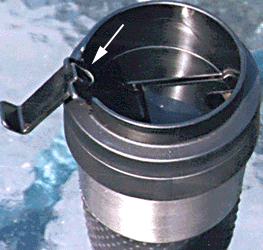 Many well-insulated commuter mugs, especially with hinged lids can collect drops of beverage within them which get transferred onto the nose of the user once they unhinge the lid to drink from it. Another common issue is the height of the edges, which are clearly designed to retain any excess liquid drops to prevent it from spilling over, however, if the edges are too high then it risks being a discomfort for the user's nose (even an average or smaller nose) as there is no place for it to accommodate it.
A semi-asymmetrical recession could probably work wonders, of course, there are other ways to approach this problem, too.
Another common mug related problem is how easy is it to clean and are there areas which can trap contents that result in bad odor. Many times, the underside of the lid has too many ridges (placed for structural integrity) or small areas where beverage contents can get trapped and are not easy to clean out of. Trapped contents will eventually begin to smell pretty bad. Even material and texture can make a difference. Certain types of plastics and rubbers actually can be difficult to clean out completely, and some even retain odor longer than others...which is bad if you are a commuter who frequently uses that cup and cannot accord a detail cleansing check or to leave the washed mug out long enough for the odor to dissipate.
Many of these problems are overlooked by the designers/manufacturers as they are more closely tied into the behavioral/maintenance aspects of the product.
Wet Sinks
 Before Use
 After Use
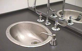
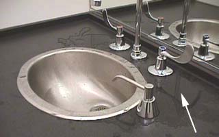
Even something as subtle as where faucets are placed in relation to the sink, how big the sink itself is, and how the water pressure is controlled can make a huge difference in the user's experience with the product(s) and also have an impact on how easy the product is to maintain.
In the first of the two images above, it shows a very standard looking sink with faucet and knobs located outside of the sink. It may not strike to someone as being a problem, but when someone does go ahead to use the faucet, water will drip and collect around the sink making the counter look dirtier as is shown in the second image above.
This easily overlooked issue is surprisingly common in many, many bathrooms - both private and public. Some suggestions for design solutions included the size of the sink, and choosing a sink with wider lips on which the faucets and knobs can be accommodated. Or a sensor which can self-adjust the flow of the water (motion sensors that automatically turn the faucet on and require no knobs are probably more ideal)
For those who may not be familiar with the term - Human Factors - it is essentially a kind of science which observes the physical and cognitive behavior of humans towards both environments and objects (tangible products and intangible service-related products such as software programs or websites). How do people of varying heights interact with a problem? What is their initial knee-jerk reaction? How easy is it to operate? Is the design so non-intuitive that it must require additional signs to prevent accidents?
Perception will usually bring attention to an apparent pattern in how people react. For instance, when someone approaches a door with a handle attached to its surface, they instinctively will try to pull it. However, if the door merely is flat with the absence of any handles, or only has a metal plate, then people instinctively understand that in order to get past this door, they must push through it - as there is no handle to actually pull. In a sense, the object itself deliberately limits options to minimize mistakes.
When designing products, services, environments, or overall experiences for people, it is essential to understand their naturally-occurring behavior ...how they intuitively react to these things when placed before them and apply this knowledge to design more intuitive solutions. Human factors is of course not an exact science because it varies slightly from person to person, of course, such as a small child to a teen to an adult to a senior (ie: A senior or a child may not be able to exert the same pressure as a teen or adult can or be able to comfortably open containers or access certain heights) and even variables such as how technically savvy they are with the latest products, or other cultural/regional differences can have an impact on how they react with the interface of certain objects.
Here were a few winners I've selected to show from Bad Designs. You can click on the titles to visit the example on that website.
Which Switch Controls the Projection Screen?
How many times have you walked into a classroom or some other conference space where the switches are literally scattered across the walls in the most non-intuitive fashion just beckoning you to guess which switch is the one you're looking for? In the image above, the switch to control the project screen is actually the one furthest away from the screen. How obvious is that?It's amazing that similar design issues continue to occur this way with little to no improvements - not not even a text or graphic label to accompany the switch.
Raised Labels or Flat Buttons?
Another analogous design issue is the one commonly found used in elevators where they have raised/embossed labels right next to the actual button which is oftentimes just flat. People have the natural reflex towards tactile surfaces. In other words, they push the graphic label as opposed to the flat button next to it, especially when it is a quick reaction (ie: a scenario where you see someone trying to make it to the elevator just as its doors are closing and try to push the "Door Open" button, which for whatever reason doesn't work. So instead of figuring out which other button to push, you risk getting your limb clamped on by sticking it out to keep the elevator doors from closing?)
Light or Breeze?
Many ceiling fans with lights integrated into them often have two switches. What's interesting is that they tend to be identical in every way - form, size, color, material, location, etc.Even if one tries to differentiate the switches by adding on a tassel or whatever, unless it's highly obvious, even that can be easy to forget. In the image above, a yellow tassel is placed one one of the two switches. But the yellow tassel could represent light or it could not. It still leaves it entirely up to the user to interpret the train of thought. A very obvious fool-proof (at least a better attempt at it) solution can be changing the location of the switches - The light switch can be hooked below the light as the fan switch hangs from above the light.
- Using & Maintaining Liquid-Oriented Products -
Coffee On Your Nose & Odor Inside
Many well-insulated commuter mugs, especially with hinged lids can collect drops of beverage within them which get transferred onto the nose of the user once they unhinge the lid to drink from it. Another common issue is the height of the edges, which are clearly designed to retain any excess liquid drops to prevent it from spilling over, however, if the edges are too high then it risks being a discomfort for the user's nose (even an average or smaller nose) as there is no place for it to accommodate it.A semi-asymmetrical recession could probably work wonders, of course, there are other ways to approach this problem, too.
Another common mug related problem is how easy is it to clean and are there areas which can trap contents that result in bad odor. Many times, the underside of the lid has too many ridges (placed for structural integrity) or small areas where beverage contents can get trapped and are not easy to clean out of. Trapped contents will eventually begin to smell pretty bad. Even material and texture can make a difference. Certain types of plastics and rubbers actually can be difficult to clean out completely, and some even retain odor longer than others...which is bad if you are a commuter who frequently uses that cup and cannot accord a detail cleansing check or to leave the washed mug out long enough for the odor to dissipate.
Many of these problems are overlooked by the designers/manufacturers as they are more closely tied into the behavioral/maintenance aspects of the product.
Wet Sinks
Before UseAfter UseEven something as subtle as where faucets are placed in relation to the sink, how big the sink itself is, and how the water pressure is controlled can make a huge difference in the user's experience with the product(s) and also have an impact on how easy the product is to maintain.
In the first of the two images above, it shows a very standard looking sink with faucet and knobs located outside of the sink. It may not strike to someone as being a problem, but when someone does go ahead to use the faucet, water will drip and collect around the sink making the counter look dirtier as is shown in the second image above.
This easily overlooked issue is surprisingly common in many, many bathrooms - both private and public. Some suggestions for design solutions included the size of the sink, and choosing a sink with wider lips on which the faucets and knobs can be accommodated. Or a sensor which can self-adjust the flow of the water (motion sensors that automatically turn the faucet on and require no knobs are probably more ideal)